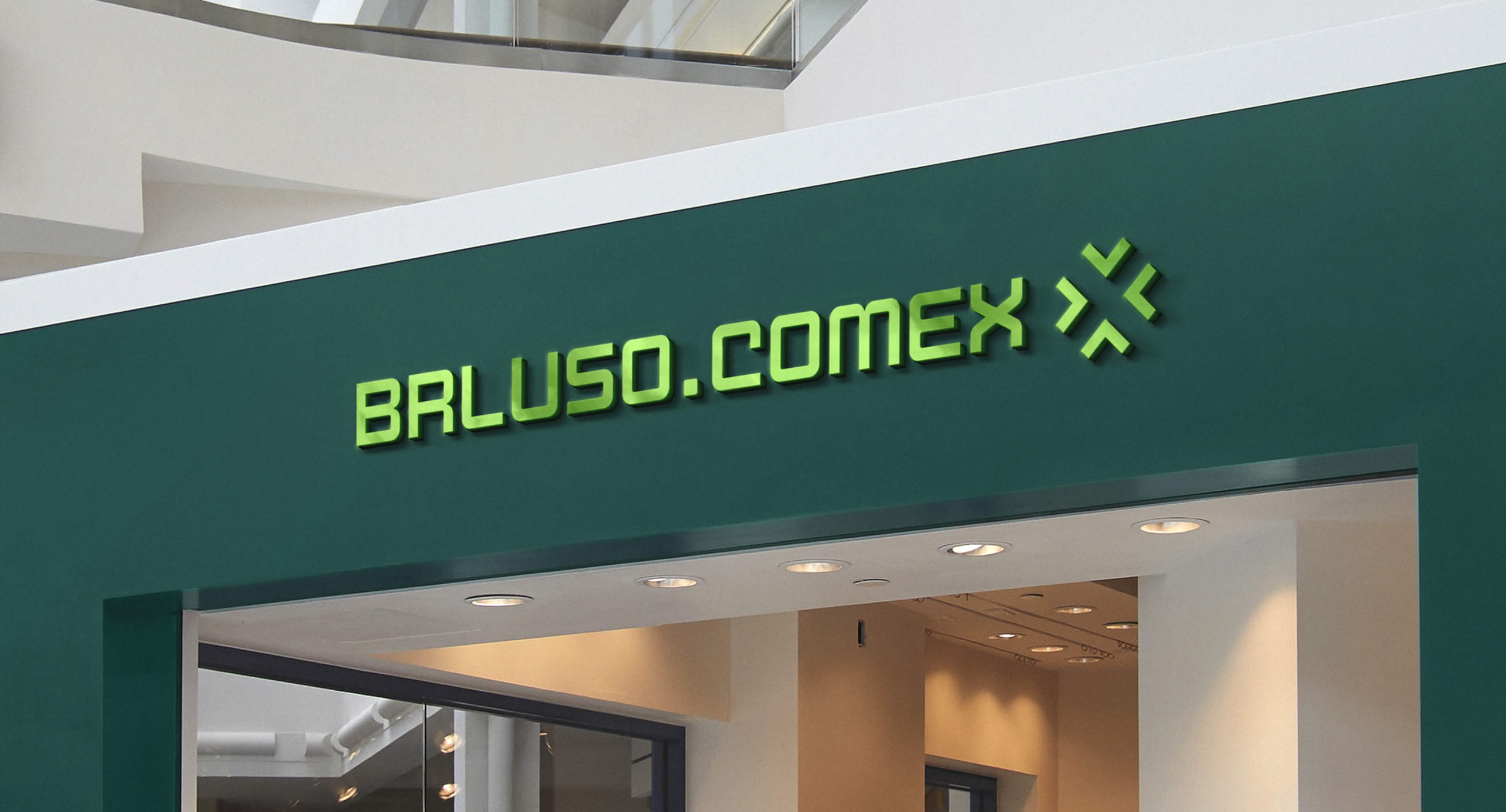
BRLuso .Comex
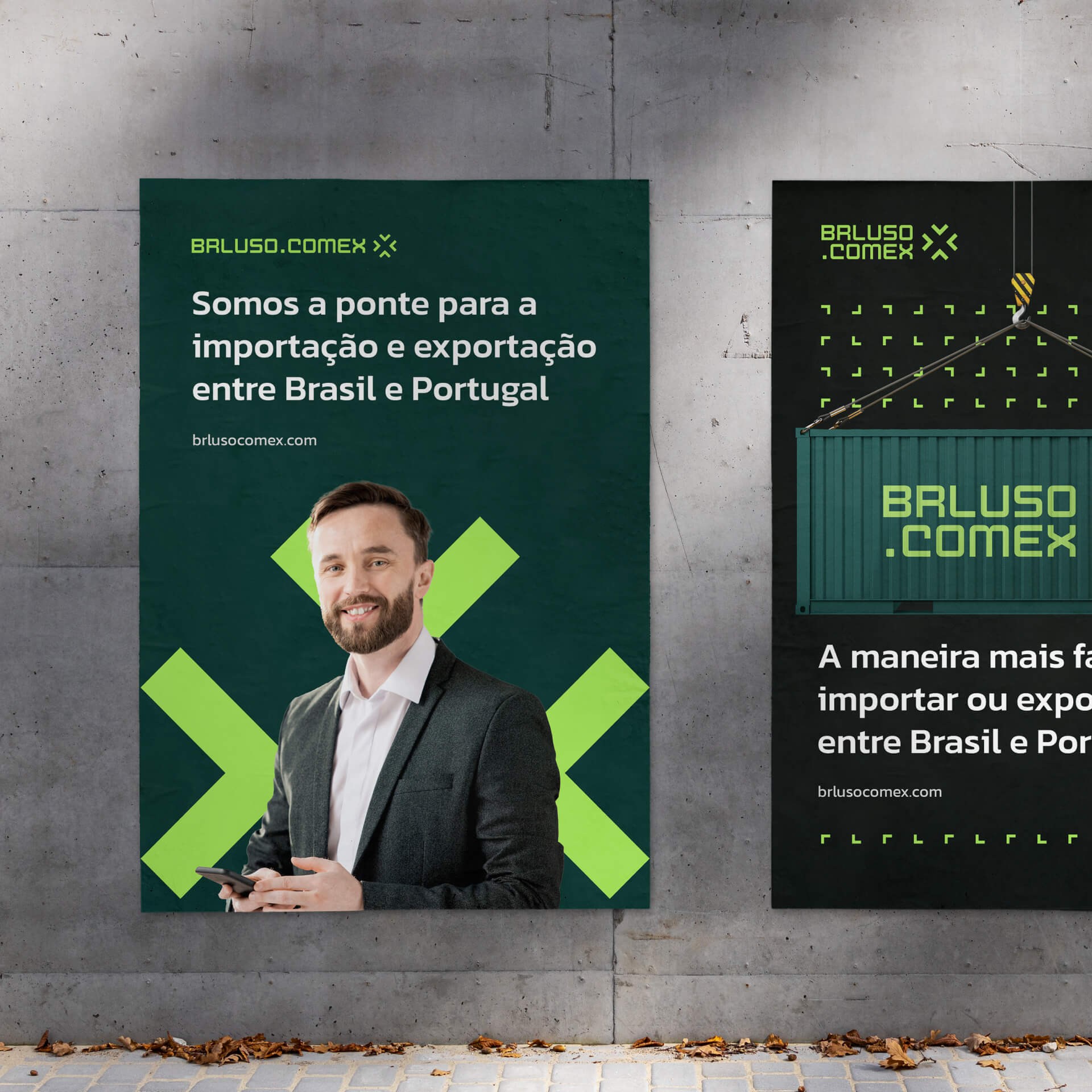
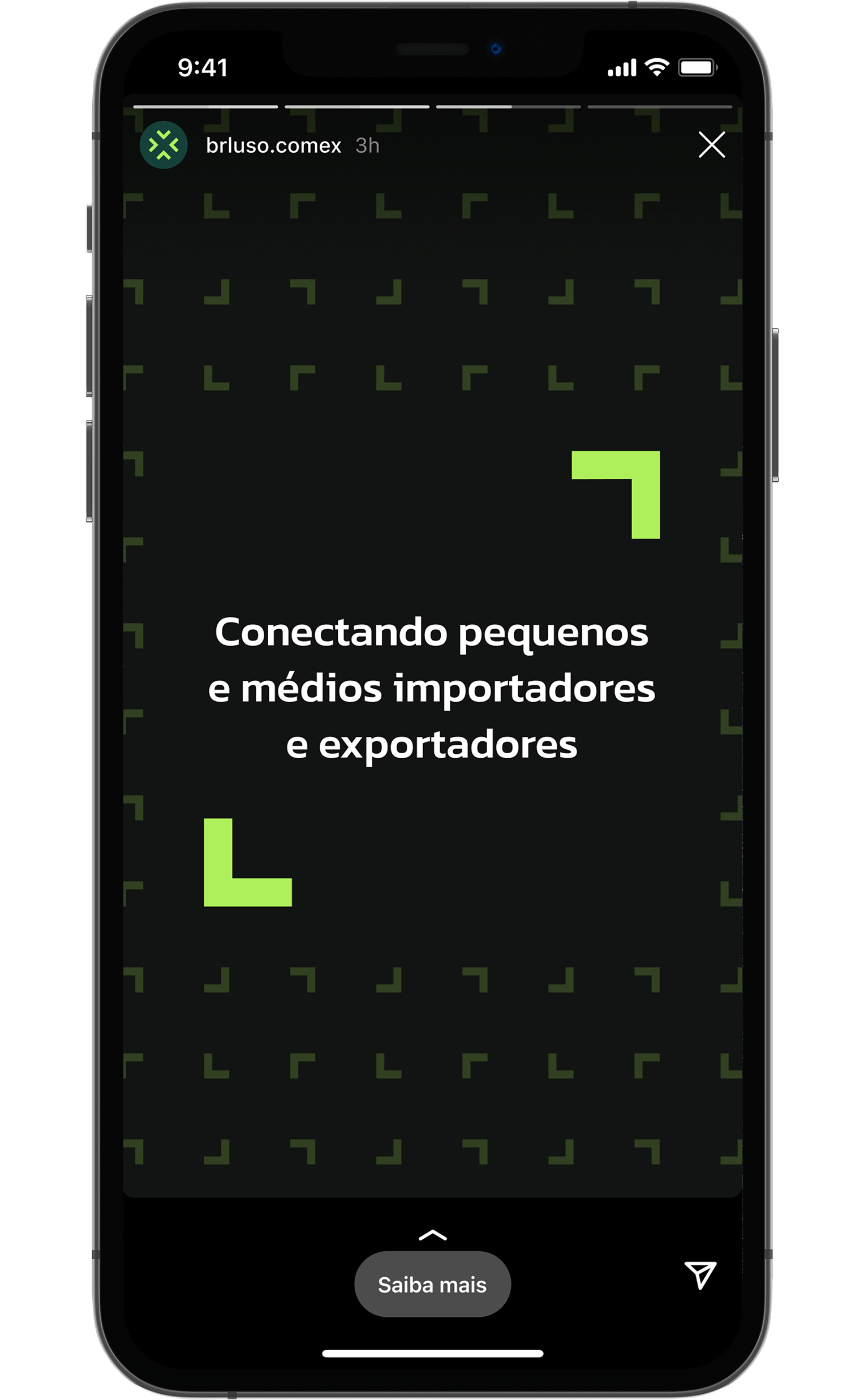
Visual identity project developed for BRLuso.Comex, a company that was born with the socio-economic purpose of strengthening commercial relations between companies from friendly countries such as Brazil and Portugal.
When Cilso came to me to develop this project, his company was still in the opening process, so we had a blank canvas and infinite possibilities to be able to create something unique and that could leverage his business.
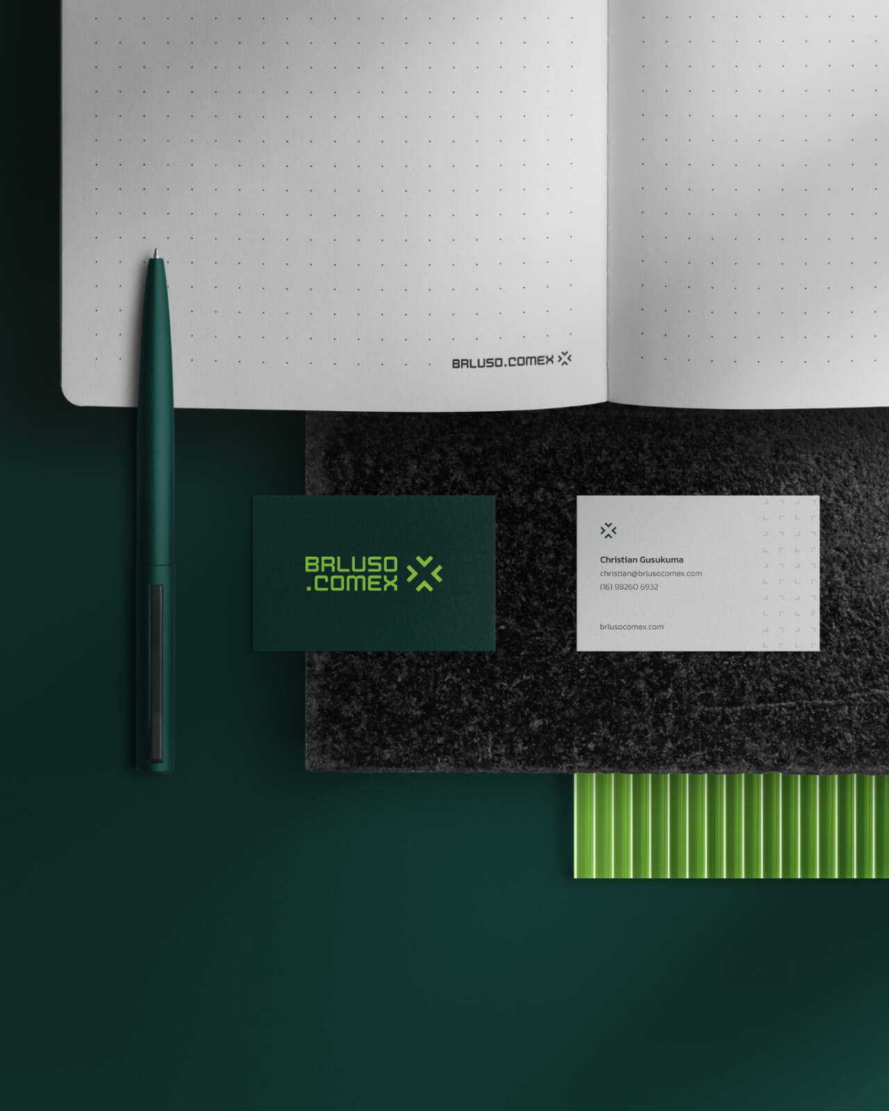
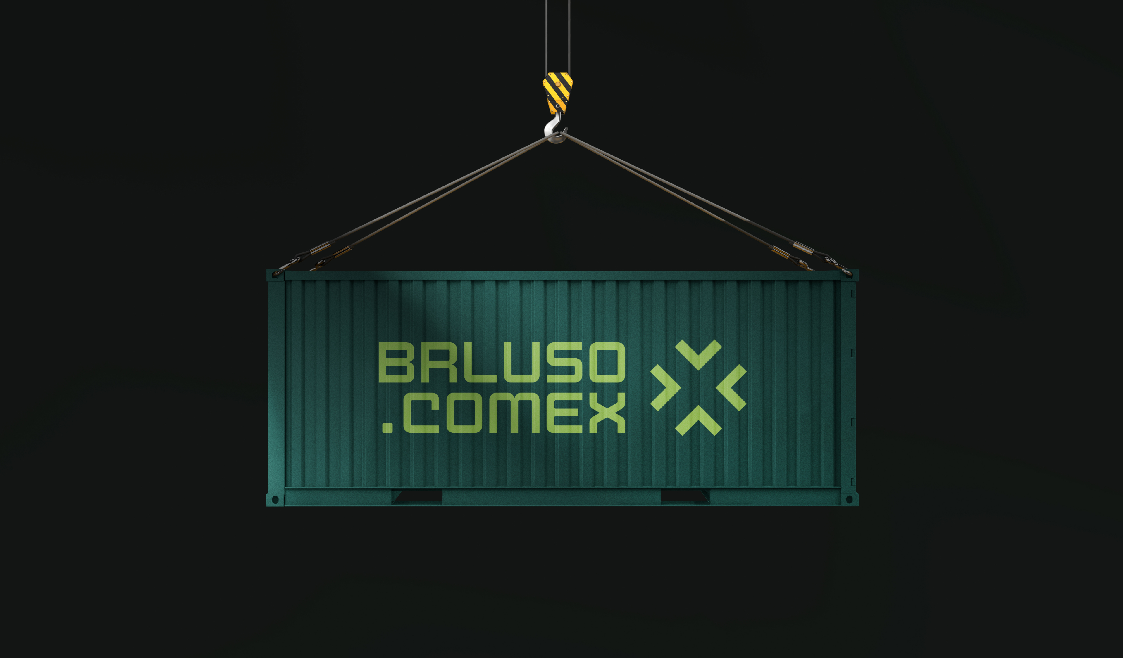
The result was a strong and vibrant brand identity that speaks to their audience and allows the company to be born big and ready to serve the international market.


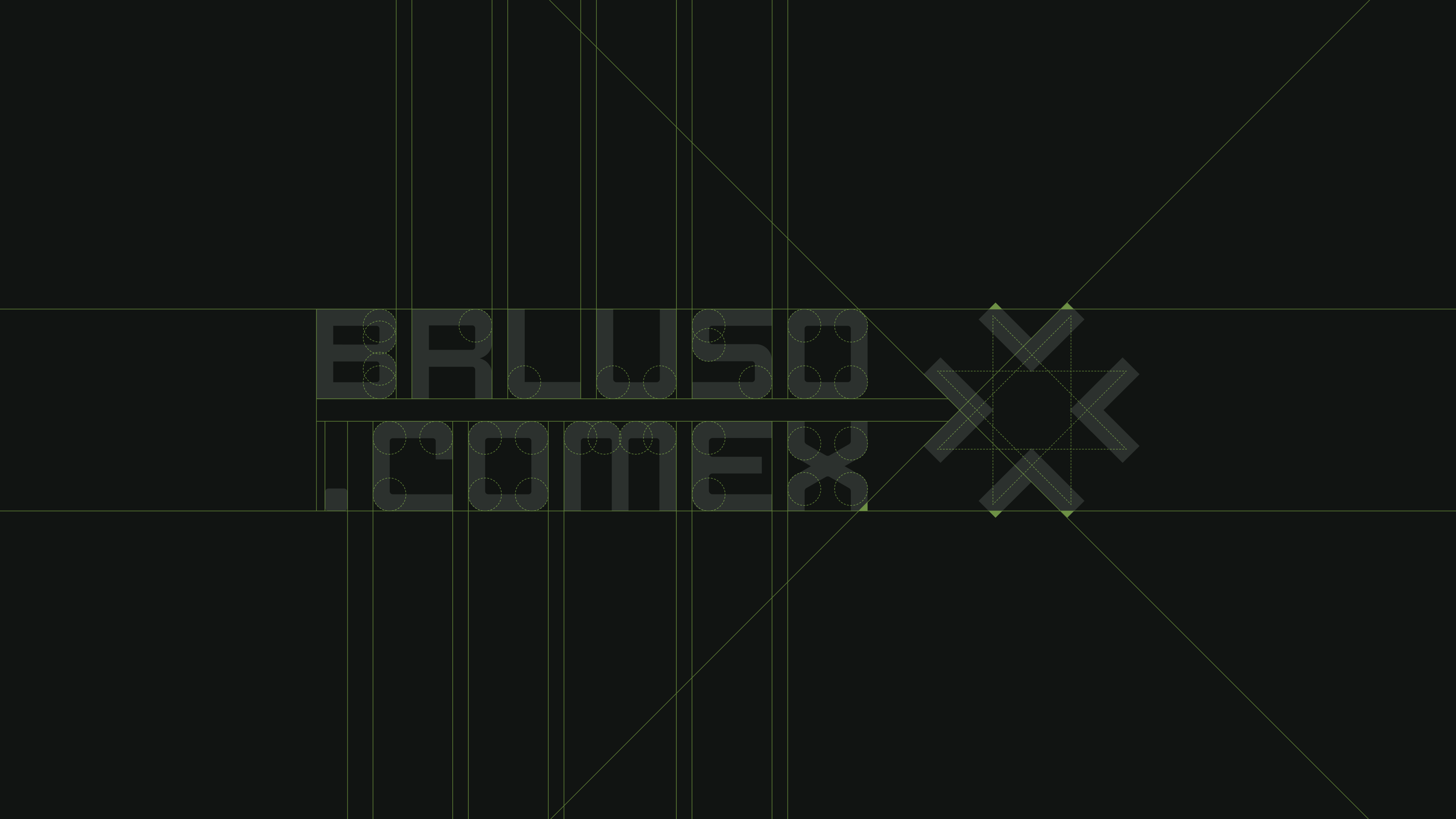


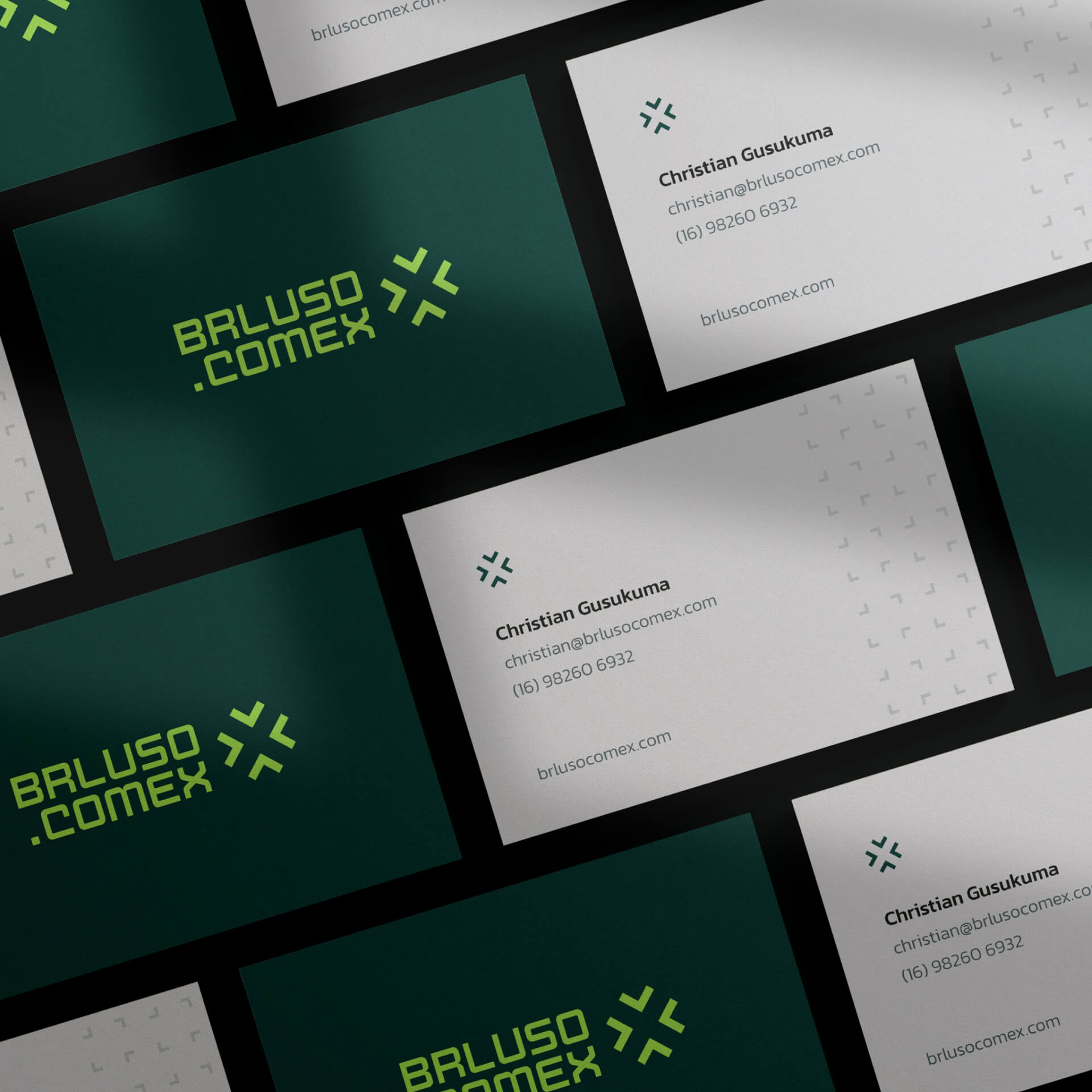
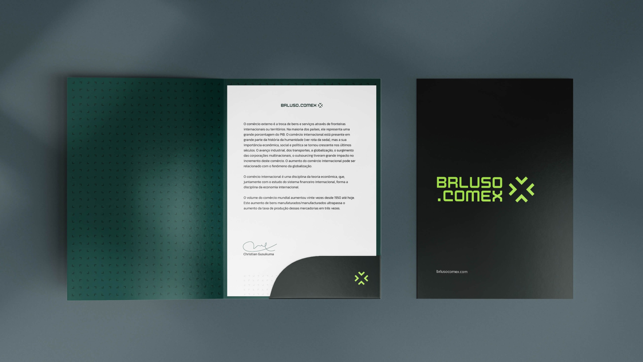
The grid used for the construction of the symbol is the same as the cross of the Order of Christ, alluding to the great Portuguese navigations, important for the clearing of trade routes around the world.
In addition, the symbol forms four arrows opposite each other symbolizing the cultural exchange between companies.


Christian has a lot of sensitivity, he captured the essence of everything I thought about as an entrepreneur and future planning, materializing in a perfect and inspiring visual identity for my business and my various types of customers!
Cilso Pinheiro Jr • BRLuso.Comex